Maple Method
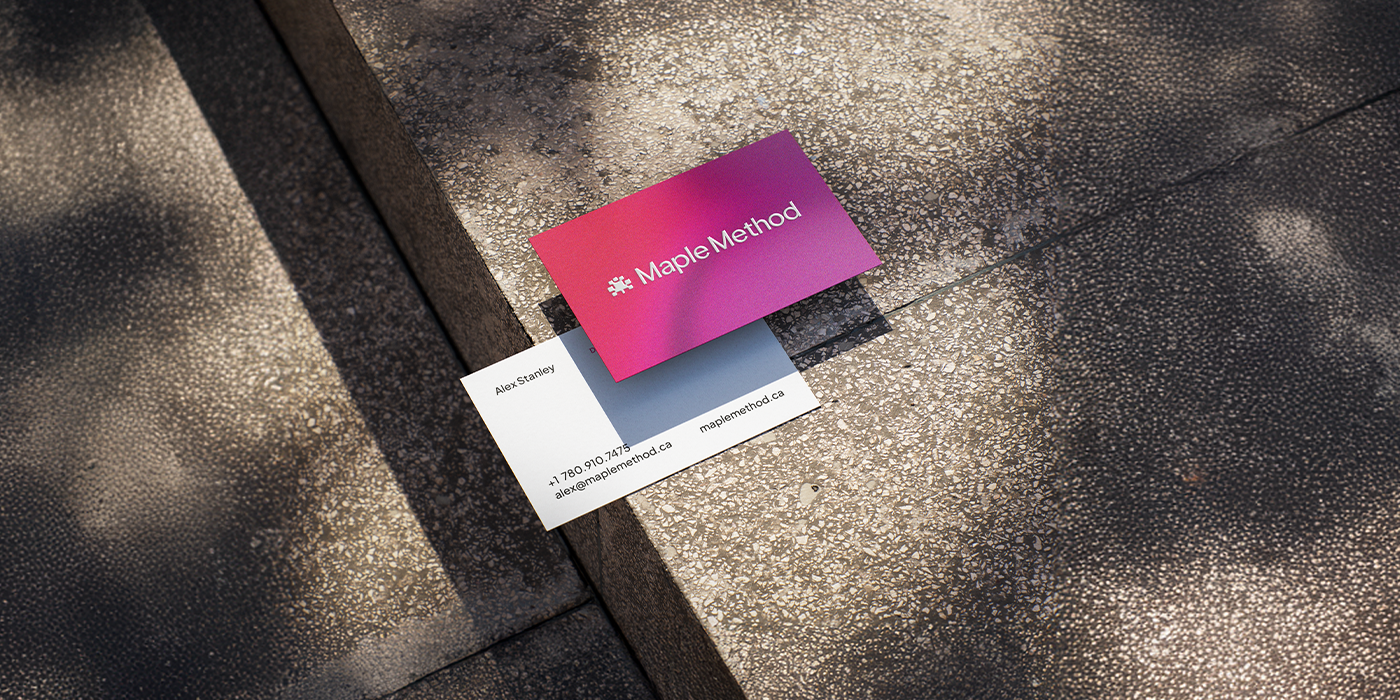
Maple Method came to us as a new Canadian, women-owned tech startup focused on system optimisation and implementation support. Their work lives at the intersection of strategy and software, helping businesses untangle messy processes and build infrastructure that actually holds up as they grow. They needed a brand that felt intelligent and capable, but not stiff or predictable. We built a full identity that reflects their technical depth while giving them a voice that feels fresh and self-assured.
We positioned the brand around making technology make sense. Maple Method works with founders and teams who are done with duct-tape solutions and ready for systems that are intentional, scalable and built properly from the start.
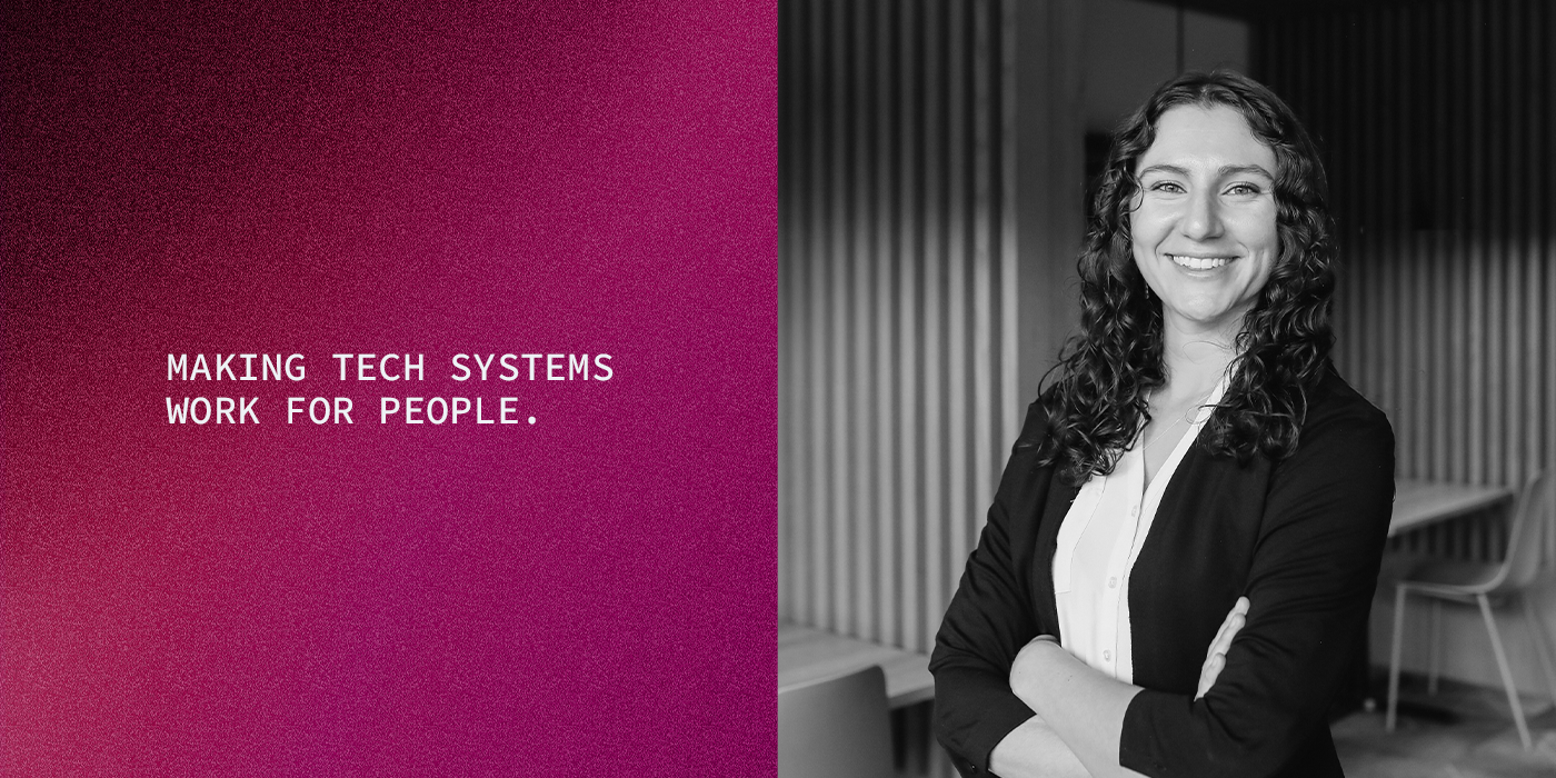
Visually, we leaned playful, less traditional and distinctly their own. Bold typography, unexpected colour pairings and a confident logo system give the brand structure without making it feel corporate. It is clean, but not sterile. Strategic, but still human. We also captured professional headshots that align with the new identity, adding warmth and credibility while putting a face to the leadership behind the company.
The result is a modern, recognisable brand that stands out in the tech space and gives Maple Method a strong foundation for growth.
Services Offered
Logo Kit
Typography
Colour Palette
Brand Guidelines
Headshots